
Color in art is so much more than just how something looks. It’s a powerful element that profoundly shapes our emotions, thoughts, and even our physical responses. Artists have long understood this, creating works that connect with viewers on a deep level. Let’s explore the fascinating world of color psychology in art, revealing how different hues affect us and how artists masterfully use color to amplify their message.
How We Perceive Color
Our journey into color begins with light. When we look at an object, light reflects off it at various wavelengths. Our eyes detect these, and our brain interprets them as distinct colors. This complex process explains why color has such a profound and almost instantaneous influence on our feelings.
A Quick Influence
Color has a remarkable influence on our perception, affecting our judgments and preferences within seconds, often subconsciously. This principle is vital in the appreciation of art, where initial impressions can be significantly shaped by color.
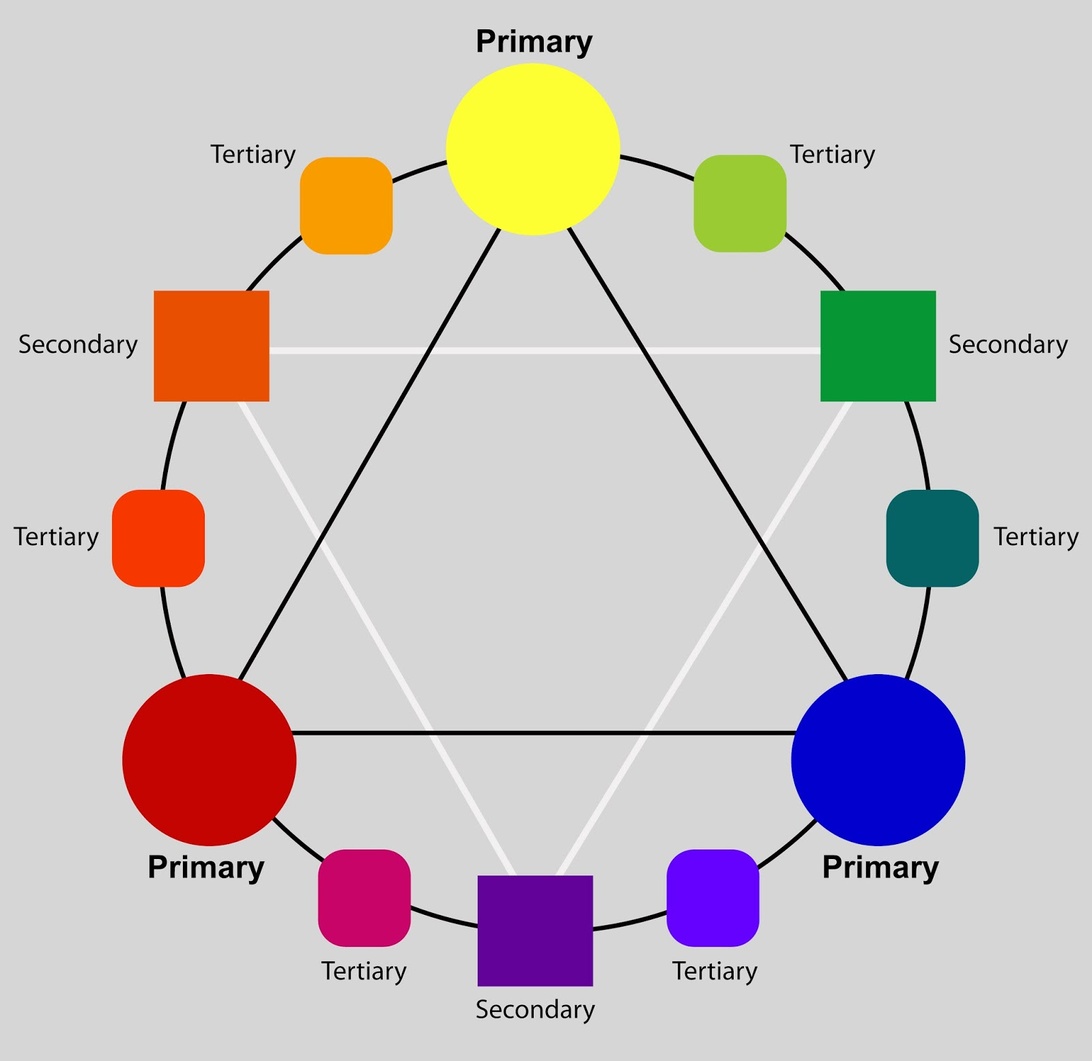
The Color Wheel and Emotional Temperature
The color wheel, a fundamental tool in art and design, organizes colors and shows how they relate to each other. It’s divided into warm colors (reds, oranges, yellows) and cool colors (blues, greens, purples). Artists use this ‘temperature’ to set the mood.
Warm Colors: Energy and Passion
Warm colors are generally associated with energy, brightness, and action. They evoke feelings of excitement, passion, and warmth, much like a fiery sunset. Artists often use warm colors to create a sense of vibrancy and dynamism in their work. For example, the bold reds and yellows in many of Van Gogh’s paintings contribute to their energetic and passionate feel.
Cool Colors: Calm and Serenity
Cool colors, on the other hand, are linked to calm, peace, and serenity, promoting feelings of tranquility. Imagine a peaceful lake – that’s the effect cool colors can create. Artists might use a palette dominated by blues and greens to evoke a sense of peace and contemplation, as seen in many of Monet’s serene water lily paintings.
Color Schemes: Harmony and Contrast in Art
Beyond individual colors, the way they’re combined—the color scheme—significantly impacts a work’s psychological effect. Different color schemes create different emotional responses.
Complementary Colors: Dynamic Tension
Complementary colors sit opposite each other on the color wheel (like red and green). They create high contrast and visual vibrancy. While effective for making elements “pop,” overuse can be overwhelming. Artists like Vincent van Gogh used complementary colors to create dynamic tension and draw attention to specific areas in their paintings.
Analogous Colors: Peaceful Unity
Analogous color schemes use colors adjacent on the color wheel (like red, orange, and yellow). They offer harmony and unity, creating a visually pleasing and flowing composition. Monet’s series of water lily paintings often employ analogous color schemes to create a sense of serene beauty and visual coherence.
Triadic Colors: Vibrant Stimulation
Triadic color schemes, using colors evenly spaced around the color wheel, are inherently vibrant. They can create stimulating and engaging visual experiences, making each element stand out while maintaining overall harmony.
The Emotional Language of Specific Colors
Colors have the remarkable ability to trigger a wide range of emotional responses. The colors around us can shape our interactions, and even influence our bodies. This emotional effect is rooted in both psychology and physiology.
Red: Passion and Intensity
Red is an emotionally intense color, evoking feelings of passion, excitement, and urgency. In art, red often draws attention and conveys strong emotions like love or anger. Artists like Mark Rothko used red to create a visceral reaction, giving their works a sense of vitality.
Orange: Creativity and Enthusiasm
Orange combines red’s energy with yellow’s joy, often associated with enthusiasm and creativity. In art, orange can create a sense of excitement. Works by artists like Paul Gauguin use bold oranges to convey adventure.
Yellow: Happiness and Optimism
Yellow is a bright color representing happiness and warmth. It can lift spirits, but in excess, it can also signal caution. Vincent van Gogh’s use of yellow in his sunflowers conveys both the vibrancy of life and the intensity of his emotions.
Green: Growth and Harmony
Green, often linked to nature, symbolizes growth and renewal, contributing to a sense of calm. Claude Monet’s landscapes are excellent examples of how green can create a peaceful atmosphere.
Blue: Calm and Serenity, but Also Sadness
Blue is associated with calm and peace. In art, it often creates a sense of tranquility. However, depending on the shade, blue can also evoke sadness. Pablo Picasso’s Blue Period is a clear example of how blue can express deep emotional states.
Purple: Mystery and Spirituality
Purple combines blue’s stability and red’s energy, often symbolizing creativity and spirituality. Artists like Gustav Klimt used purple to add a mystical quality to their works.
Black and White: Contrast and Depth
While technically not colors, black and white are powerful tools. Artists often use them to evoke timelessness or stark realism. The interplay of light and shadow enhances the depth, drawing viewers in.
Physiological Responses to Color
Our reactions to color aren’t just emotional; they can be physical. Red can elevate heart rate, while blue can have a calming effect, potentially lowering blood pressure.
Cultural Significance: A World of Different Meanings
Color symbolism is vital in art, religion, politics, and ceremonies. Colors’ strong emotional connotations can subtly influence us. However, the meaning of color isn’t universal; it varies significantly across cultures. Artists must be mindful of these nuances.
Western Traditions
In Western cultures, white often symbolizes purity and is commonly used in weddings, while black is associated with mourning and formality.
Eastern Perspectives
In some Eastern cultures, white represents mourning, a stark contrast to Western traditions. Red, in many Eastern cultures, symbolizes luck and prosperity, often featured prominently in celebrations and ceremonies.
Indigenous Symbolism
In many Indigenous cultures, colors are deeply connected to nature and spirituality. Specific colors might represent elements of the natural world, ancestral spirits, or ceremonial practices. Understanding these associations is crucial for appreciating the depth of meaning in Indigenous art forms.
A Historical View: Key Movements in Color
The exploration of color psychology has a rich history, evolving alongside art itself.
The Dawn of Color Theory
Formal studies began with Isaac Newton’s color wheel. Poet Johann Wolfgang von Goethe then pioneered a psychological approach, arguing that color perception was both physiological and psychological, significantly influencing artists.
Impressionism: Capturing Light
The Impressionist movement revolutionized color use by focusing on the fleeting effects of light and using complementary colors to represent shadows, moving away from traditional academic approaches.
Expressionism: Color as Emotion
Expressionists like Kandinsky delved into color’s emotional power, associating colors with emotions and sounds. Yves Klein, with his “International Yves Klein Blue” (IKB), believed monochrome fields could evoke a sense of the infinite, demonstrating the profound impact of a single, carefully chosen hue.
The Therapeutic Power of Color
Color significantly influences psychological development, impacting cognitive, emotional, and social growth. Its therapeutic applications are increasingly recognized.
Color in Art Therapy
Art therapy uses art-making to communicate. It provides a non-verbal way to process emotions. Therapists use color to facilitate emotional expression, recognizing the subjective nature of color associations.
Creating Calming Environments
Beyond formal therapy, specific color palettes are used in various settings, from hospitals to homes, to promote well-being. Soothing blues and greens are frequently employed to help reduce feelings of anxiety.
Color in Modern and Contemporary Art
Modern artists have harnessed color’s emotional power in diverse ways. Piet Mondrian used primary colors to create harmony. In contemporary art, color remains a crucial element, used in increasingly innovative ways.
Installations and Digital Art
Artists like Olafur Eliasson create interactive installations where color changes perception. In digital art, color is explored through projections to create immersive experiences. Street art uses color to capture attention and convey powerful messages, often using bold and contrasting hues to make a statement.
New Possibilities
Digital art and new media are expanding the possibilities of color in art, with interactive installations and color-changing displays becoming increasingly common.
Choosing Colors: Practical Advice for Artists
Understanding color psychology can be a powerful tool. Here are some tips:
Define Your Message
What emotions do you want to convey? Start by identifying the core message. For example, if you’re aiming for a sense of mystery and introspection, you might consider a palette dominated by deep blues and purples.
Choose a Dominant Color
Select a dominant color that aligns with your message. This will set the overall tone. If you want to convey energy and passion, red might be your dominant color, drawing inspiration from artists who have effectively used red to create a sense of dynamism.
Create a Harmonious Palette
Use the color wheel to create a harmonious or contrasting palette. To evoke tranquility, explore an analogous palette of blues and greens, drawing inspiration from Monet’s water lily series. If you want to convey a sense of unease, consider using a discordant color scheme with clashing complementaries, much like Edvard Munch did in ‘The Scream’.
Experiment and Reflect
Don’t be afraid to experiment! Observe how different colors interact. Consider how they make you and others feel.
Consider Cultural Context
If your work will be viewed by a diverse audience, consider the cultural connotations of your color choices. Be mindful of how different cultures might interpret the same colors.
The Subjectivity of Color
It’s important to remember that while color psychology provides valuable insights, individual responses to color are subjective and influenced by personal experiences. What evokes joy in one person might evoke sadness in another. This inherent subjectivity adds another layer of complexity and richness to the use of color in art.
Color’s Enduring Significance
In conclusion, color choices in art are deeply rooted in psychology and emotion. By understanding these reactions, and the cultural and individual factors influencing color perception, artists can use color to create works with powerful emotional and communicative potential. Color is not merely decorative; it’s a central part of art’s ability to move, influence, and connect with us. The exploration of color’s influence remains a dynamic and ongoing journey for artists and viewers alike, constantly reshaping our perception and experience of art.